Plasma
Functions
create
utilitiesPlasma.create(className: string,--
The class name of the Instance to create
props: CreateProps) → Instance--
The created instance
A function that creates an Instance tree.
CreateProps is a table:
- String keys are interpreted as properties to set
- Numerical keys are interpreted as children
- Function values are interpreted as event handlers
- Table keys can be used to get references to instances deep in the tree, the value becomes the key in the table
This function doesn't do anything special. It just creates an instance.
create("Frame", {
	BackgroundTransparency = 1,
	Name = "Checkbox",

	create("TextButton", {
		BackgroundColor3 = Color3.fromRGB(54, 54, 54),
		Size = UDim2.new(0, 30, 0, 30),

		create("UICorner", {
			CornerRadius = UDim.new(0, 8),
		}),

		Activated = function()
			setClicked(true)
		end,
	}),
})
Getting references to instances deep in a tree:
local ref = {}

create("Frame", {
	create("TextButton", {
		[ref] = "button",
		Text = "hi"
	})
})

print(ref.button.Text) --> hi
hydrateAutomaticSize
This item only works when running on the client. Clientutilities
Applies automatic sizing to any current or future instances in the DataModel that are tagged with
"PlasmaAutomaticSize". Attributes axis (string) and maxSize (UDim2 or Vector2) are allowed.
useStyle
stylePlasma.useStyle() → ()Returns the current style information, with styles that are set more recently in the tree overriding styles that were set further up. In this way, styles cascade downwards, similar to CSS.
setStyle
stylePlasma.setStyle(styleFragment: {[string]: any}--
A dictionary of style information
) → ()Defines style for any subsequent calls in this scope. Merges with any existing styles.
automaticSize
utilitiesPlasma.automaticSize() → ()Applies padding-aware automatic size to the given GUI instance. This function sets up events to listen to further changes, so should only be called once per object.
Also supports ScrollingFrames by correctly clamping actual and canvas sizes.
note
If this function is called from the server, if maxSize is a UDim2, because of differing screen sizes, it instead
configures the instance to be compatible with the Plasma.hydrateAutomaticSize function, adding the
CollectionService tag and other attributes.
You must also call hydrateAutomaticSize once on the client for this to work.
::warning There is currently no way to undo this other than destroying the instance. Once automatic sizing has been applied, it is always applied to that instance. :::
new
Plasma.new() → Node--
An opaque object which holds persistent state about your UI.
createContext
Plasma.createContext(name: string--
The human-readable name of the context. This is only for debug purposes.
) → Context--
An opqaue Context object which holds persistent state.
Creates a [Context] object which is used to pass state downwards through the tree without needing to thread it through every child as props.
useContext
hooksPlasma.useContext(context: Context--
A context object previously created with createContext
) → TReturns the value of this context provided by the most recent ancestor that used provideContext with this context.
provideContext
Plasma.provideContext(context: Context,--
A context object previously created with createContext
value: T--
Any value you want to provide for this context
) → ()Provides a value for this context for any subsequent uses of useContext in this scope.
useEffect
hooksPlasma.useEffect(callback: () → () | () → () → (),--
A callback function that optionally returns a cleanup function
...: any--
Dependencies
) → ()
useEffect takes a callback as a parameter which is then only invoked if passed dependencies are different from the
last time this function was called. The callback is always invoked the first time this code path is reached.
If no dependencies are passed, the callback only runs once.
This function can be used to skip expensive work if none of the dependencies have changed since the last run. For example, you might use this to set a bunch of properties in a widget if any of the inputs change.
useState
hooksPlasma.useState(initialValue: T--
The value this hook returns if the set callback has never been called
) → (T,--
The previously set value, or the initial value if none has been set
(newValue: T) → ()--
A function which when called stores the value in this hook for the next run
)local checked, setChecked = useState(false)
useInstance(function()
local TextButton = Instance.new("TextButton")
TextButton.Activated:Connect(function()
setChecked(not checked)
end)
return TextButton
end)
TextButton.Text = if checked then "X" else ""
useKey
Plasma.useKey(key: string | number) → ()Specify a key by which to store all future state in this scope. This is similar to React's key prop.
This is important to use to prevent state from one source being still being applied when it should actually reset.
useInstance
hooks
useInstance takes a callback which should be used to create the initial UI for the widget.
The callback is only ever invoked on the first time this widget runs and never again.
The callback should return the instance it created.
The callback can optionally return a second value, which is the instance where children of this widget should be
placed. Otherwise, children are placed in the first instance returned.
useInstance returns the ref table that is passed to it. You can use this to create references to objects
you want to update in the widget body.
start
Plasma.start(rootNode: Node,--
A node created by Plasma.new.
fn: (...: T) → (),...: T--
Additional parameters to callback
) → ()
Begins a new frame for this Plasma instance. The callback is invoked immediately.
Code run in the callback function that uses plasma APIs will be associated with this Plasma node.
The callback function is not allowed to yield.
If this function is used, Plasma.beginFrame, Plasma.continueFrame, and Plasma.finishFrame should not be used.
beginFrame
Plasma.beginFrame(rootNode: Node,--
A node created by Plasma.new.
fn: (...: T) → (),...: T--
Additional parameters to callback
) → ContinueHandle--
A handle to pass to continueFrame
Begins a continuable Plasma frame. Same semantics as Plasma.start.
For a frame:
- Call
beginFrameonce. - Call
continueFrameany number of times. - Call
finishFramewhen the frame is complete.
If this function is used, Plasma.start should not be used.
finishFrame
Plasma.finishFrame(rootNode: Node--
A node created by Plasma.new.
) → ()Finishes a continuable Plasma frame, cleaning up any objects that have been removed since the last frame.
continueFrame
Plasma.continueFrame(continueHandle: ContinueHandle,--
An object returned by Plasma.start
fn: (...: T) → (),...: T--
Additional parameters to callback
) → ()Continue the Plasma frame with a new handler function. Calling this will not trigger any cleanup that typically happens every frame.
This is intended to be used to continue creating UI within the same frame that you started on. You should call
Plasma.beginFrame once per frame, then Plasma.continueFrame any number of times after that, finally calling
Plasma.finishFrame.
scope
Plasma.scope(fn: (...: T) → (),...: T--
Additional parameters to callback
) → ()
Begins a new scope. This function may only be called within a Plasma.start callback.
The callback is invoked immediately.
Beginning a new scope associates all further calls to Plasma APIs with a nested scope inside this one.
widget
Plasma.widget(fn: (...: T) → ()--
The widget function
) → (...: T) → ()--
A function which can be called to create the widget
This function takes a widget function and returns a function that automatically starts a new scope when the function is called.
checkbox
widgetsPlasma.checkbox(label: string,--
The label for the checkbox
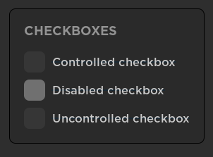
options: {disabled: boolean,checked: boolean}) → CheckboxWidgetHandleA checkbox. A checkbox may either be controlled or uncontrolled.
By passing the checked field in options, you make the checkbox controlled. Controlling the checkbox means that
the checked state is controlled by your code. Otherwise, the controlled state is controlled by the widget itself.
Returns a widget handle, which has the fields:
checked, a function you can call to check if the checkbox is checkedclicked, a function you can call to check if the checkbox was clicked this frame
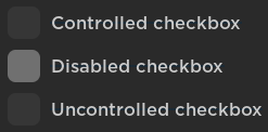
Plasma.window("Checkboxes", function()
	if Plasma.checkbox("Controlled checkbox", {
		checked = checked,
	}):clicked() then
		checked = not checked
	end

	Plasma.checkbox("Disabled checkbox", {
		checked = checked,
		disabled = true,
	})

	Plasma.checkbox("Uncontrolled checkbox")
end)
portal
widgetsPlasma.portal(children: () → ()--
Children
) → ()
The portal widget creates its children inside the specified targetInstance. For example, you could use this
to create lighting effects in Lighting as a widget:
return function(size)
	portal(Lighting, function()
		useInstance(function()
			local blur = Instance.new("BlurEffect")
			blur.Size = size
			return blur
		end)
	end)
end
space
Plasma.space(size: number) → ()Blank space of a certain size.
highlight
Types
interface HighlightOptions {outlineColor?:: Color3fillColor?:: Color3fillTransparency?:: numberoutlineTransparency?:: numberfillMode?:: HighlightFillMode}Creates a highlight over an instance with the specified options, using the Roblox Highlight instance
blur
widgetsPlasma.blur(size: number--
The size of the blur
) → ()A blur effect in the world. Created in Lighting.
button
widgetsPlasma.button(label: string--
The label for the checkbox
) → ButtonWidgetHandleA text button.
Returns a widget handle, which has the field:
clicked, a function you can call to check if the checkbox was clicked this frame
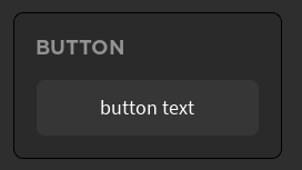
Plasma.window("Button", function()
	if Plasma.button("button text"):clicked() then
		print("clicked!")
	end
end)
row
widgetsLays out children horizontally
window
widgetsPlasma.window(children: () → ()--
Children
) → WindowWidgetHandleTypes
interface WindowOptions {title?: stringclosable?: booleanmovable?: booleanresizable?: boolean}A window widget. Contains children.
- Closable
- Draggable
- Resizable
Returns a widget handle, which has the field:
closed, a function you can call to check if the close button was clicked.
heading
widgetsText, but bigger!
table
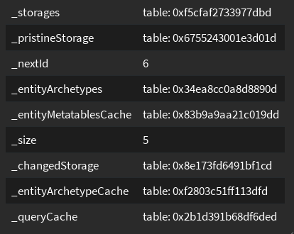
widgetsPlasma.table(items: {{string}},) → TableWidgetHandleA table widget. Items is a list of rows, with each row being a list of cells.
Returns a widget handle, which has the fields:
selected, a function you can call to check what row and cell were selected this frame, if anyselectedHeading, a function you can call to check which heading was selected this frame, if anyhovered, a function you can call to check what row is being hovered over
local items = {
	{"cell one", "cell two"},
	{"cell three", "cell four"}
}
arrow
widgetsPlasma.arrow() → ()arrow(from: Vector3, to: Vector3)-> Creates an arrow betweenfromandtoarrow(point: Vector3)-> Creates an arrow pointing atpointarrow(cframe: CFrame)-> Creates an arrow with its point at the CFrame position facing the CFrame LookVectorarrow(part: BasePart)-> Arrow represents the Part's CFramearrow(fromPart: BasePart, toPart: BasePart)-> Arrow between the two parts
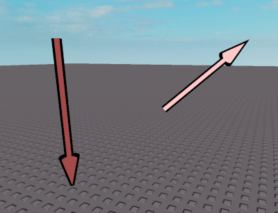
Plasma.arrow(Vector3.new(0, 0, 0))
Plasma.arrow(Vector3.new(5, 5, 5), Vector3.new(10, 10, 10))
spinner
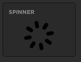
widgetsPlasma.spinner() → ()A spinner widget, indicating loading.
label
widgetsPlasma.label(text: string) → ()Text.